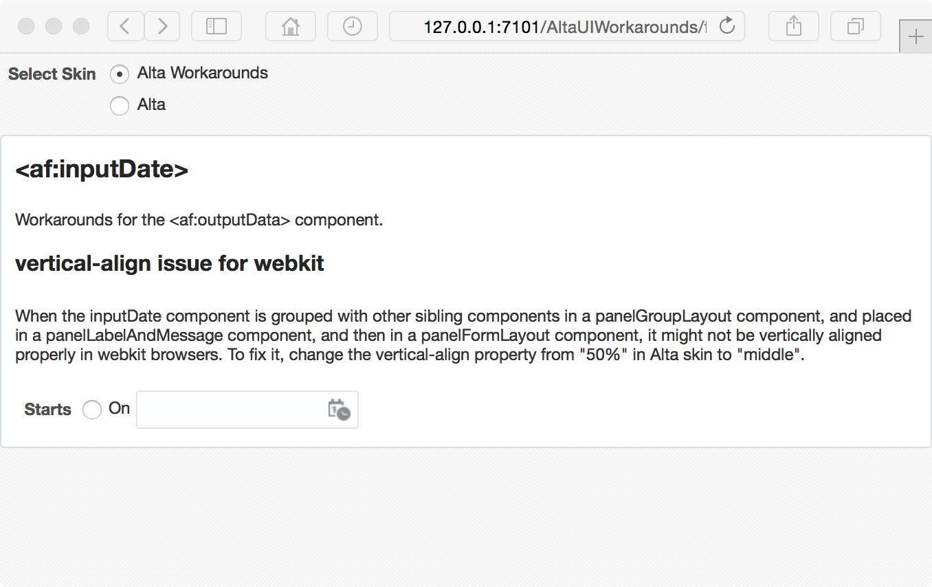
Wednesday, December 17, 2014

ADF - The value attribute of SelectMany components

The selection components allow the user to select single and multiple values from a list or group of items. The value attribute of SelectOne components is straightforward, but what about the value of SelectMany components?

ADF Faces provides a number of SelectMany components. The selectManyCheckbox component is one of them which allows the user to select multiple values from a series of checkboxes. In the Tag Reference of the component, the type of the value attibute is Object, and the description:

the value of the component. If the EL binding for the "value" points to a bean property with a getter but no setter, and this is an editable component, the component will be rendered in read-only mode.

Simply the same as it for other components. Not much helpful. After some digging, I found the following code snippet:

// org.apache.myfaces.trinidadinternal.renderkit.core.xhtml.SimpleSelectManyRenderer

// OK, is this a List or an array?
boolean isList = ((modelClass == null) ||
                  modelClass.isAssignableFrom(List.class));
boolean isArray = (modelClass != null) && modelClass.isArray();
// We only support lists and arrays;  if neither, quit.
if (!isList && !isArray)
{
  _throwUnsupportedModelType(context, modelClass, component);
}

Clearly, the value attribute of SelectMany components, must be a List or an Array, and the default type is List.

You can download the sample application - SelectManyCheckbox.jws. This application demonstrates how to handle the value attribute and process the selected items of the selectManyCheckbox component.

Image: sample page

In this sample application. The value attribute of one of selectManyCheckbox components is designed to be an Array; and the other one is left simply as an Object.

private Weekday[] days = new Weekday[] { Weekday.Sunday, Weekday.Saturday };
private Object sports;

Once the user makes some selections on both components, and submit. You can find the message from the Log Window like this:

>>> days: [Lcom.adfsamples.view.beans.SelectManyBean$Weekday;
>>> sports: java.util.ArrayList

The data type of the first component (days) is an Array as expected, and the second one (sports) is handled as an ArrayList, the default data type for the value attribute.

Sample Applications:

Environment:

  • Oracle Alta UI
  • JDeveloper 12.1.3.0.0 Build JDEVADF12.1.3.0.0GENERIC_140521.1008.S
  • Safari Version 8.0.2 (10600.2.5)
  • Mac OS X Version 10.10.1 (Yosemite)

Resources:

Oracle Fusion Middleware Tag Reference for Oracle ADF Faces 12c (12.1.3)

Monday, December 15, 2014

ADF - panelLabelAndMessage's undocumented skin property

When working on the skinning of the panelLabelAndMessage component, you may have noticed a special skinning technique used for this component. For example, from a simple snippet below:

<af:panelLabelAndMessage label="Label 1" id="plam1">
  <af:outputText value="outputText in panelLabelAndMessage" id="ot1"/>
</af:panelLabelAndMessage>

An HTML output is rendered with something like this:

<td valign="top" style="padding-left:14px" class="AFPanelFormLayoutContentCell af_panelLabelAndMessage_content-cell">outputText in panelLabelAndMessage</td>

I'm talking about the "padding-left:14px" inline style which actually comes from the skin (Alta UI skin for this case). For some reason, a special undocumented ADF Skin property is used to give the hint to the renderkit to generate this inline style. You can find it in the skin file of for example Alta UI (or Skyros):

alta-v1-desktop.css:

/* For non-input content, we need to render some padding on the panelLabelAndMessage
 * content-cell to align the leading edge of the content with the input content. */
af|panelLabelAndMessage {
  -tr-output-content-padding: 14px;
}

Here's the Properties window:

Image: af|panelLabelAndMessage - Properties

Luckily, we can customize the value in the extended skin file, or simply remove it with the -tr-inhibit ADF Skin property:

af|panelLabelAndMessage {
  -tr-inhibit: -tr-output-content-padding;
}

Chinese Summary:

ADF 在 组件 panelLabelAndMessage 的皮肤中,使用了一个没有正式文档的 ADF 皮肤属性 "-tr-output-content-padding" 用以为 panelLabelAndMessage 的非输入型内容生成 HTML 的内联样式,添加前置留白,从而方便其与输入型的内容对齐。

Resources:

Tuesday, December 9, 2014

Alta UI Workarounds - panelFormLayout

After days of hard working to fix issues of vertical alignment and distribution between different components in a complex form, I realized I need a unified solution, instead of ad-hoc, case by case pixel tuning for Oracle Alta UI skin. This is the second post on Alta UI Workarounds, but it would be first in the table of content of the series.

Considering the massive size of the skin file, the posts and workarounds are by no means exaustive, just some notes, good ideas or bad ideas. We will start from some basic rules and then the panelFormLayout component.

To align inline-level boxes, the basic idea here is to align them vertically using "vertical-align: middle", then make sure the height of all inline-level boxes is as described below.

For replaced inline elements, inline-block elements, and inline-table elements, the height of the inline-level box is their margin box; for non-replaced inline elements, it's their "line-height". Thus, we use a global "line-height"; setup a target line box height, then try best to make the height of margin boxes of all inline elements other than non-replaced inline elements to be the target line box height.

To simplify alignment, as long as possible, try keep vertical padding and margin distributed evenly to the top and bottom side, so that they work for any "vertical-align" value in the same way. For horizontal padding and margin, distribute them evenly to the left and right side, so that they work for both ltr and rtl direction.

Ok, here comes the basic rules I'm using:

.XTargetLineBoxHeight:alias {
  height: 28px;
}

/* The target line-height in pixel for the default font-size (12px) is 18px 
 * (leaving 10px for the top and bottom paddings), thus set line-height here
 * to unitless value of 1.5 (18/12 = 1.5). 
 */
.XDefaultLineHeight:alias {
  line-height: 1.5;
}

/* margin box height = border box height + margin-top + margin-bottom */
.XDefaultFormControlHeightMarginBox:alias {
  -tr-rule-ref: selector(".XTargetLineBoxHeight:alias");
}

.XDefaultFormControlHeightBorderBox:alias {
  -tr-rule-ref: selector(".XTargetLineBoxHeight:alias");
}

.XFormControlVerticalMargins:alias {
  margin-top: 0;
  margin-bottom: 0;
}

/* TODO: revisit this setting */
.XFormCellVerticalPaddings:alias {
  padding-top: 2px;
  padding-bottom: 2px;
}

Now, apply the basic rules to panelFormLayout:

/* in panelFormLayout, use consistent line-height for better vertical
 * alignment and vertical distribution. 
 */
af|panelFormLayout {
  -tr-rule-ref: selector(".XDefaultLineHeight:alias");
}

/* use the same padding for the top and bottom of the form cell to simplify
 * the logic of vertical spacing between cells.
 */
.AFPanelFormLayoutContentCell,
af|panelFormLayout::content-cell,
af|panelFormLayout::label-cell,
af|panelLabelAndMessage::content-cell.AFPanelFormLayoutContentCell {
  -tr-rule-ref: selector(".XFormCellVerticalPaddings:alias");
}

Then, we need style the label in the panelFormLayout component.

/* make label an fixed-height inline-block element, so that it aligns with
 * other components easier, either for start or top labelAlignment, or 
 * for top, middle or bottom vertical-align.
 */
.XLabel:alias {
  box-sizing: border-box;
  display: inline-block;
  vertical-align: middle;
  padding: 5px 0;
  -tr-rule-ref: selector(".XDefaultLineHeight:alias");    
  -tr-rule-ref: selector(".XTargetLineBoxHeight:alias");
}

af|panelFormLayout label {
  -tr-rule-ref: selector(".XLabel:alias");
}

Now, the bad news first, we still have to play that tedious pixel game - fixing line-height and padding for many form control components, especially agent specific styles. The good news is, this time, we have clearly defined simple rules. We can do it in a consistent way. For example, to fix the styles of the inputText component, I have the following:

/* basic styling of inputText */
.XInputText:alias {
  box-sizing: border-box;
  display: inline-block;
  vertical-align: middle;
  margin: 0;
  padding: 4px 6px;
  border-width: 1px;
  -tr-rule-ref: selector(".XDefaultLineHeight:alias");    
  -tr-rule-ref: selector(".XTargetLineBoxHeight:alias");    
}

af|inputText::content {
  -tr-rule-ref: selector(".XInputText:alias");    
}

The really dirty part is actually to remove styles from the inherited skin. I'm trying to do it in this way:

af|inputText::label {
  -tr-inhibit: padding-top;
}
af|inputText::label:rtl {
  -tr-inhibit: padding-top;
}

and in this way:

/* reset native radio and checkbox input elements, so that they line up 
 * with their labels properly. 
 */
.XSelectOneRadioNativeInput:alias {
  position: static;
  vertical-align: middle;
  margin: 0;
  padding: 0;    
}

af|selectBooleanRadio::native-input,
af|selectOneRadio::native-input,
af|selectBooleanCheckbox::native-input,
af|selectManyCheckbox::native-input,
af|selectBooleanRadio::native-input:rtl,
af|selectOneRadio::native-input:rtl,
af|selectBooleanCheckbox::native-input:rtl,
af|selectManyCheckbox::native-input:rtl {
    -tr-rule-ref: selector(".XSelectOneRadioNativeInput:alias");
}

@agent webkit, gecko, ie {
  af|selectOneRadio::native-input,
  af|selectBooleanRadio::native-input,
  af|selectBooleanCheckbox::native-input,
  af|selectManyCheckbox::native-input,
  af|selectOneRadio::native-input:rtl,
  af|selectBooleanRadio::native-input:rtl,
  af|selectBooleanCheckbox::native-input:rtl,
  af|selectManyCheckbox::native-input:rtl {
    -tr-rule-ref: selector(".XSelectOneRadioNativeInput:alias");
  }
}

Here's the display result of the sample page with Alta UI:

Image: panelFormLayout with Alta UI

This is the result from the extended UI skin:

Image: panelFormLayout with Alta UI Workarounds

The workaround looks better. It perfectly lines up components and labels horizontally, distributes components vertically, and it works in a consistent way for different components and layouts.

Sample Applications:

Environment:

  • Oracle Alta UI
  • JDeveloper 12.1.3.0.0 Build JDEVADF12.1.3.0.0GENERIC_140521.1008.S
  • Safari Version 8.0
  • Mac OS X Version 10.10

Sunday, December 7, 2014

Alta UI Workarounds - inputDate's vertical-align in webkit

Having a lot of fun, and even more pain in the last month, playing with new Oracle Alta UI. This post is meant to be the opening of the Alta UI Workarounds topic, a collection of short posts on working around Alta UI skin. Check out the AltaUIWorkarounds label and the Sample Application!

Okay, here comes the first case. When the inputDate component is grouped with other sibling components in a panelGroupLayout component, and placed in a panelLabelAndMessage component, and then in a panelFormLayout component, it might not be vertically aligned properly in webkit browsers. Say, the following code:

<af:panelFormLayout id="pfl1">
    <af:panelLabelAndMessage id="plam1" label="Starts">
        <af:panelGroupLayout id="pgl3">
            <af:selectBooleanRadio id="sbr1" text="On" label="On" simple="true"/>
            <af:inputDate id="id1" label="On" simple="true"/>
        </af:panelGroupLayout>
    </af:panelLabelAndMessage>
</af:panelFormLayout>

The fragment is rendered like this:

Image: inputDate with Alta UI

Th problem is in the Alta UI skin file (alta-v1-desktop.css, ln:6133):

@agent webkit {
  af|panelLabelAndMessage::content-cell.AFPanelFormLayoutContentCell af|inputDate {
    /*TODO ALTA*/
    vertical-align: 50%;
  }
}

To fix the issue, simply override the rule in your extended skin file like this:

@agent webkit {
  af|panelLabelAndMessage::content-cell.AFPanelFormLayoutContentCell af|inputDate {
    vertical-align: middle; /* vertical-align: 50%; (ln:6133) */
  }
}

Now the fragment is rendered as expected:

Image: inputDate with Alta UI Workarounds

Vertically aligning those input components in a consistent way, say with vertical-align: middle, helps to avoid this kind of glitches.

Sample Applications:

Environment:

  • Oracle Alta UI
  • JDeveloper 12.1.3.0.0 Build JDEVADF_12.1.3.0.0_GENERIC_140521.1008.S
  • Safari Version 8.0
  • Mac OS X Version 10.10

Friday, December 5, 2014

ADF - Change Skin at Runtime

For a ADF Faces application, you can configure the skin family for the application in the trinidad-config.xml file. The trinidad-config.xml allows you to define properties using the Expression Language (EL) or static values. The skin-family is one of such properties that accepts EL expression as the value, so that you can enable end users to change the application’s ADF skin at runtime by exposing a component that allows them to update the value of the skin-family property.

In the Sample Application, the `trinidad-config.xml” file is configured like this:

<?xml version="1.0" encoding="UTF-8"?>
<trinidad-config xmlns="http://myfaces.apache.org/trinidad/config">
  <skin-family>#{skinSelectorBean.skinFamily}</skin-family>
</trinidad-config>

Then in the sample page, a selectOneRadio component is provided, allowing end users to switch between the Alta skin and the Skyros skin:

<af:selectOneRadio id="sor1" label="Select Skin" autoSubmit="true"
                   valueChangeListener="#{skinSelectorBean.skinFamilyValueChanged}"
                   value="#{skinSelectorBean.skinFamily}">
  <af:selectItem id="si1" label="Alta" value="alta"/>
  <af:selectItem id="si2" label="Skyros" value="skyros"/>
</af:selectOneRadio>

When the end user chooses the skin from the list, the skinFamily property value of the backing bean is updated, and then the valueChangeListener method of the backing bean is called. The method updates the whole view in response to the change of the skin, such that the view is rendered with the selected skin. Here, nothing special. The only interesting part is how to update the whole view properly. Please see the comments for the detail.

public void skinFamilyValueChanged(ValueChangeEvent valueChangeEvent) 
throws IOException {
    // ValueChangeEvent is handled in the PROCESS_VALIDATIONS phase. 
    // Calling refreshPage() will skip the UPDATE_MODEL_VALUES phase 
    // which we need to update skinFamily. We have to queue this event 
    // to the INVOKE_APPLICATION phase.
    if (valueChangeEvent.getPhaseId() != PhaseId.INVOKE_APPLICATION) {
        valueChangeEvent.setPhaseId(PhaseId.INVOKE_APPLICATION);
        valueChangeEvent.queue();
        return;
    }

    // refresh the whole view
    refreshView();
}

private void refreshView() {
    FacesContext facesContext = FacesContext.getCurrentInstance();
    String viewId = facesContext.getViewRoot().getViewId();
    ViewHandler viewHandler = facesContext.getApplication().getViewHandler();
    UIViewRoot root = viewHandler.createView(facesContext, viewId);
    root.setViewId(viewId);
    facesContext.setViewRoot(root);
}

Chinese Summary:

trinidad-config.xml 配置文件中,可以设置 skin-family 属性的值为 EL 表达式。通过相应的组件可以允许用户在运行时更新该表达式的值,从而动态地选择用应用程序的 ADF 皮肤。

Sample Application:

Environment:

JDeveloper 12.1.3.0.0 Build JDEVADF_12.1.3.0.0_GENERIC_140521.1008.S

Thursday, November 27, 2014

ADF - Access resources packaged in an ADF Library JAR

Oracle ADF and JDeveloper support packaging a reusable component and its resources into an ADF Library JAR. When the component is consumed by a web application, ADF and JDeveloper automatically make the resources of component available at runtime to serve requests. At most time, you don’t have to care about the detail behind the scene. But if the resources (css, js, png, jpeg, etc.) cannot be served from the ADF Library JAR, or only some special resources cannot be accessed, then this post is probably for you. As using bundled font files in a web application is getting so popular these days (e.g. Bootstrap uses font files for its glyph icons), I guess you are reading this post probably because of missing font files (eot,ttf,woff,svg).

When you deploy a project into an ADF Library JAR, JDeveloper packages artifacts under the web content root directory (if any) to the JAR. When you make use of a component from the JAR in your web application JDeveloper extends the web.xml file in your web application with two key players for accessing resources from an ADF Library JAR - the adflibResources servlet and the ADFLibraryFilter.

Here’s the entries for the adflibResources servlet:

<servlet>
  <servlet-name>adflibResources</servlet-name>
  <servlet-class>oracle.adf.library.webapp.ResourceServlet</servlet-class>
</servlet>

<servlet-mapping>
  <servlet-name>adflibResources</servlet-name>
  <url-pattern>/adflib/*</url-pattern>
</servlet-mapping>

And the entries for the ADFLibraryFilter:

<filter>
  <filter-name>ADFLibraryFilter</filter-name>
  <filter-class>oracle.adf.library.webapp.LibraryFilter</filter-class>
</filter>

<filter-mapping>
  <filter-name>ADFLibraryFilter</filter-name>
  <url-pattern>/*</url-pattern>
  <dispatcher>FORWARD</dispatcher>
  <dispatcher>REQUEST</dispatcher>
</filter-mapping>

Usually, JDeveloper can add these entries automatically if it’s aware that you are using a component from an ADF Library JAR, for example, when you use the wizard to create a page based on a page template exposed from the JAR. If for some reason, these entries are not there, you can surely manually add them there.

At runtime, when the web application serves a request, if a resource is not found in the web content directory of the web application, the ADFLibraryFilter forwards the request to the adflibResources servlet to load the resource from the ADF Library JAR. By default, the resources handled by the ADFLibraryFilter are files with an extension in the following list:

",png,jpg,jpeg,gif,js,css,htm,html,"

So, for any other type of resources, you will end up with a 404 error. Fortunately, it’s allowed to customize this list. For the Bootstrap font files case, you can customize the extension list with the include-extension-list initialization parameter of the ADFLibraryFilter like this:

<filter>
  <filter-name>ADFLibraryFilter</filter-name>
  <filter-class>oracle.adf.library.webapp.LibraryFilter</filter-class>
  <init-param>
    <param-name>include-extension-list</param-name>
    <param-value>,png,jpg,jpeg,gif,js,css,htm,html,eot,ttf,woff,svg,</param-value>
  </init-param>
 </filter>

Chinese Summary:

为了加载 ADF 库文档中的资源,Web 应用程序的 web.xml 文件需要配置 adflibResources servlet 以及 ADFLibraryFilter 过滤器。对于特殊文件类型的资源,例如字体文件等,还需要配置 ADFLibraryFilter 的初始化参数以允许其处理此类文件。

Sample Application:

Environment:

JDeveloper 12.1.3.0.0 Build JDEVADF_12.1.3.0.0_GENERIC_140521.1008.S

Tuesday, November 25, 2014

ADF - Package reusable components into an ADF Library JAR

When we work on ADF components, we may want to reuse them across different projects, applications and teams. Oracle ADF and JDeveloper support to package reusable components and associated artifacts into an ADF Library JAR. An ADF Library JAR is a special JAR containing ADF components and appropriate control files for the components. ADF page templates is one of types of these high-level reusable components that can be packaged into an ADF Library JAR.

I’m not going to introduce how to package reusable ADF components into an ADF Library JAR in general here again, because the official documentation Developing Fusion Web Applications with Oracle Application Development Framework itself is a great resource where you can learn about it. You can find the information from the chapter 44 Reusing Application Components.

In this post, taking page templates as an example, I’ll be talking about a practical approach to package only required artifacts into an ADF Library JAR, leaving irrelevant files out of it, and still allowing us to develope and test the reusable components easily.

You can find and download sample sources for this post. The sample sources consists of two applications - the pagetemplates application for the ADF Library containing the page template, and the consumer application that uses the page template from the ADF Library:

Image: Sample Applications

To create ADF page templates as reusable components, we start from an ADF ViewController project. In the sample applications, the pagetemplates-webapp project in the pagetemplates application is such an ADF ViewController project. It uses the popular Bootstrap framework to create a very simple page template. We can test the page template with test pages in the root directory of web contents.

If we create an ADF Library JAR deployment profile for the pagetemplates-webapp project to package the page template as a reusable component, we will have all the required artifacts and resources in the result ADF Library JAR. As a side-effect, some artifacts we don’t really want will also be included, such as those test pages and irrelevant metadata files, in this case, files under the WEB-INF/ directory, etc. Unfortunately, it’s now allowed to configure the files and folders that are to be packaged into an ADF Library JAR.

You can surely remove unwanted artifacts from the project to get a tidy JAR, but that will make development and testing of your page templates very hard. You might consider creating another ADF ViewController project that uses the deployed ADF Library JAR to test the page templates. Better this time, but every time you make a change to you page templates, you have to build and deploy your ADF Library JAR, and then rebuild and run your testing project to see the result. You would eventually rather stay with your untidy JAR.

To get a clean ADF Library JAR without making testing a nightmare, instead of deploying the ADF Library JAR directly from the original ADF ViewController project containing the page templates, we can create another ADF ViewController project dedicated in deployment purpose. This second project is a bare ViewController project actually, with all appropriate project source paths configured to point to the corresponding ones in the original project. With project source paths, it’s allowed to configure a list of files or folders that are to be specifically included in the current project, such that you can choose now which artifacts are going to be packaged into the ADF Library JAR deployment profile.

In the sample application, the pagetemplates-adflib project is created as an ADF ViewController project for this purpose. Once the project is created, its project source paths are set to point to the respective ones in the pagetemplates-webapp project, and choose to include or exclude selected files or folders for the current project.Particularly, In the Project Source Paths window, it looks like this:

Image: Project Properties / Project Source Paths

And in the Project Source Paths: Web Application window, the setting is as follow:

Image: Project Properties / Project Source Paths: Web Application

Finally, create an ADF Library JAR deployment profile for the pagetemplates-adflib project:

Image: Project Properties / Deployment

Note: the deploy folder is configured intentionally under the root folder containing the sample applications.

With this approach, we can develop and test the page templates in the full ADF ViewController project, and deploy the ADF Library JAR any time from the bare ViewController project. The same approach also works for other types of reusable ADF components. Enjoy!

Chinese Summary:

在开发可重用的 ADF 组件,并将其打包为 ADF 库文档时,如果不希望包含那些无关的配置文件和用于测试的文件时。可以创建两个 ADF 视图控制器项目,其中之一为完整项目,包含组件及其所需工件和资源文件,以及所有用于测试的文件。另一个为裸项目,其项目源代码路径都设置指向完整项目中的对应路径,同时设置包含在该项目中的文件或目录的列表。基于这个方法,完整的项目用于开发和测试可重用组件;而为裸项目定义一个 ADF 库文档部署概要文件,专门用于部署 ADF 库文档。

Sample Applications:

Environment:

  • Mac OS X Version 10.10
  • Safari Version 8.0
  • JDeveloper 12.1.3.0.0 Build JDEVADF_12.1.3.0.0_GENERIC_140521.1008.S
  • Oracle Alta UI

Monday, October 27, 2014

Ignoring Files Specific to Oracle JDeveloper & ADF

If you are using Oracle JDeveloper and ADF with some version control system, such as Git, here’s a minimum list of JDeveloper and ADF specific untracked files and directories you will want to add to your .gitignore file to ignore them:

.data/
temp/
classes/
cwallet.sso.lck

The .data/ directory is the application storage directory used by the IDE Performance Cache feature. For each application, you can specify a directory where application-specific caches and indexes used by JDeveloper are stored. To customize the location of the directory, open the Application Properties dialog, then go to the IDE Performance Cache page.

Image: IDE Performance Cache

The default location is the root directory of the application:

Image: IDE Performance Cache

The temp/ directory is used for ADF styles caching. It gets created under the WEB-INF/ directory in the web content directory of the view project, when you open a page or page fragment in the design mode in JDeveloper.

Image: ADF Styles caching

The classes/ directory is the default Output Directory for the project. It can be customized in the Project Properties dialog, Project Source Paths page.

Image: Project Source Paths

The cwallet.sso.lck file is the lock file for the wallet.sso file which is a part of Oracle Credential Store Framework.

The ignore file list is also useful when you are using Subversion or CVS.

Chinese Summary:

针对 Oracle 的 JDeveloper 和 ADF 的,用于版本控制系统的忽略文件列表。可以添加到诸如 Git 的 .gitignore 文件,或者类似的其它版本控制系统(Subversion 和 CVS)的忽略文件中。

Sunday, October 26, 2014

ADF - Displaying Multi-Line Text with outputText Component

With ADF, the inputText component can be used to generate a multi-row text area control in browser, allowing the user to enter multi-line text. To display the multi-line text that the user input, a common practice is using a read-only multi-row inputText component. I bet this approach isn't always what you want, as the inputText component has fixed rows, and shows a scrollbar when necessary. In this post, I'm describing how to display multi-line text with the outputText component. It's about CSS line-wrapping and word-breaking pertaining to ADF faces components.

To display multi-line text, the basic idea is applying the white-space CSS property to the element with one of following values: pre, pre-wrap and pre-line. This property controls the processing of whitespace inside an element. The exact value you need depends on the behavior you want. In this post, I'm using pre-wrap as the example, which means "Sequences of whitespace are preserved. Lines are broken at newline characters, at <br>, and as necessary to fill line boxes.". Here's the code snippet from the skin of the sample application:

.PreWrap {
    white-space: -moz-pre-wrap; /* Mozilla */
    white-space: pre;           /* CSS 2.0 */
    white-space: pre-wrap;      /* CSS 2.1 */
    word-wrap: break-word;      /* IE 5.5-7 */
}

In this rule, the word-wrap CSS property specifies whether the break within a word is allowed to prevent overflow when an otherwise-unbreakable string is too long to fit within line box. The property is applies only when the white-space property allows wrapping. The value of break-word means "Normally unbreakable words may be broken at arbitrary points if there are no otherwise acceptable break points in the line." This property is useful for the cases, such as really long URLs.

For example, the normal word-breaking runs like the following:


As you can see, it tries the best to wrap the text to fit within the line box by breaking the text after the hyphens which are acceptable break points. But it still overflows.

With break-word, it runs like this:


Now, it breaks the text at arbitrary points in addition to those acceptable break points.

The white-space and word-wrap properties are supposed to be what exactly you need to display multi-line text with the outputText ADF Faces component, but it's not the whole story. You have to deal with the layout component to make sure the outputText component inside it works as you expect. Here, I'm talking about the panelFormLayout and then panelGridLayout components - the most common layout components that the multi-line outputText components will work with.

To work with the panelFormLayout component, wrap the outputText component with the PreWrap style class in a 
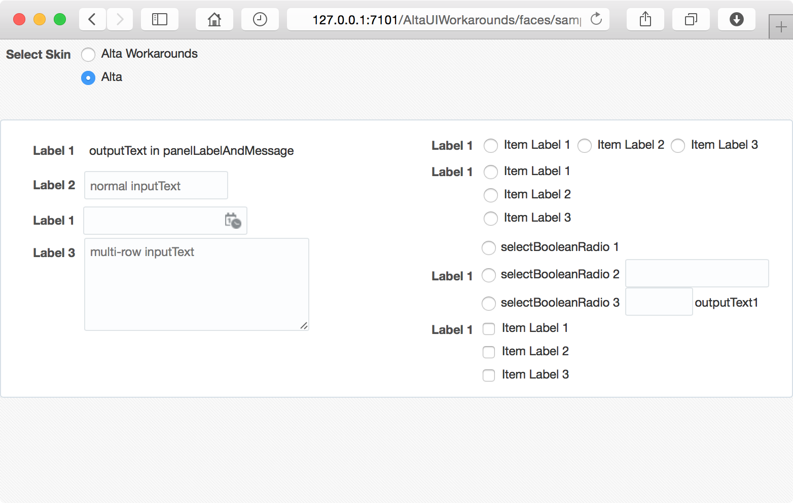
panelLabelAndMessage component, and put it into the panelFormLayout component:

<af:panelFormLayout id="pfl1" labelWidth="100" fieldWidth="350">
    <af:inputText id="it1" label="inputText"
                  placeholder="Add some multi-line text and click Update to display it below."
                  contentStyle="width:340px;" rows="12" value="#{pageFlowScope.text}"/>
    <af:button text="Update" id="b_updt"/>
    <af:panelLabelAndMessage id="plam1" label="outputText" labelStyle="vertical-align:top">
        <af:outputText id="ot1" value="#{pageFlowScope.text}" partialTriggers="b_updt"
                       styleClass="PreWrap"/>
    </af:panelLabelAndMessage>
</af:panelFormLayout>

If there is a long unbreakable string in the text, it works like this (See panelFormLayout page in the sample application):


Even with the fieldWidth="350" property, the content cells (with yellow background) of the panelFormLayout still expand to fit the longest unbreakable string.

The panelFormLayout component generates table elements to layout the components inside it. By default, the table element uses the automatic table layout algorithm. In case the content does not fit in the column,  the column's width is set by the preferred minimum width, e.g. by trying all acceptable line breaks.

This is how it works - by default. Fortunately, we can change this behavior by changing the table-layout CSS property of the table from auto to fixed. For example:

.FixedTableLayout af|panelFormLayout::column > table {
    table-layout: fixed;
    width: 100%;
}

This ADF skin rule makes sure that tables generated by the panelFormLayout component for columns use the fixed layout algorithm: "Table and column widths are set by the widths of table and col elements or by the width of the first row of cells. Cells in subsequent rows do not affect column widths".  Apply the rule to the example (panelFormLayout-fixedTableLayout.jsf):

<af:panelFormLayout id="pfl1" labelWidth="100" fieldWidth="350" styleClass="FixedTableLayout">
    <af:inputText id="it1" label="inputText"
                  placeholder="Add some multi-line text and click Update to display it below."
                  contentStyle="width:340px;" rows="12" value="#{pageFlowScope.text}"/>
    <af:button text="Update" id="b_updt"/>
    <af:panelLabelAndMessage id="plam1" label="outputText" labelStyle="vertical-align:top">
        <af:outputText id="ot1" value="#{pageFlowScope.text}" partialTriggers="b_updt"
                       styleClass="PreWrap"/>
    </af:panelLabelAndMessage>
</af:panelFormLayout>


Or, keeping the table-layout: auto property, to achieve the same purpose, we can wrap the outputText component inside a fixed-width containing box (panelFormLayout-fixedWidthContainer.jsf):

<af:panelFormLayout id="pfl1" labelWidth="100" fieldWidth="350">
    <af:inputText id="it1" label="inputText"
                  placeholder="Add some multi-line text and click Update to display it below."
                  contentStyle="width:340px;" rows="12" value="#{pageFlowScope.text}"/>
    <af:button text="Update" id="b_updt"/>
    <af:panelLabelAndMessage id="plam1" label="outputText" labelStyle="vertical-align:top">
        <af:panelGroupLayout id="pgl1" layout="vertical" styleClass="FixedWidthContainer">
            <af:outputText id="ot1" value="#{pageFlowScope.text}" partialTriggers="b_updt"
                           styleClass="PreWrap"/>
        </af:panelGroupLayout>
    </af:panelLabelAndMessage>
</af:panelFormLayout>

Here's the CSS rule:

.FixedWidthContainer {
    display: block;
    width: 340px;
    background-color: #fbf; /* for visual hint only */
}


We are good with the panelFormLayout component now. Let's try out the panelGridLayout Component. If we put the multi-line outputText component directly inside a gridCell component as in the following code snippet (panelGridLayout.jsf):

<af:gridCell id="gc4" marginStart="10px" marginEnd="10px" width="340px"
             inlineStyle="background-color:#ffb;">
    <af:outputText id="ot1" value="#{pageFlowScope.text}" partialTriggers="b_updt"
                   styleClass="PreWrap"/>
</af:gridCell>

It works like this:


Pretty much the same problem as that in the panelFormLayout component. That's because for the geometry management purpose, the gridCell component generates an absolutely positioned div element inside the div element generated by the panelGridLayout component. For an absolutely positioned block, it width is determined by so-called shrink-to-fit width - similar to calculating the width of a table cell using the automatic table layout algorithm.

We don't have a layout property this time, but we can still work around this by wrapping the outputText component inside a fixed-width containing block (panelGridLayout-fixedWidthContainer.jsf):

<af:gridCell id="gc4" marginStart="10px" marginEnd="10px" styleClass="af_gridCell">
    <af:panelGroupLayout id="pgl3" layout="vertical" styleClass="FixedWidthContainer">
        <af:outputText id="ot1" value="#{pageFlowScope.text}" partialTriggers="b_updt"
                       styleClass="PreWrap"/>
    </af:panelGroupLayout>
</af:gridCell>

Now, it works like this:


In summary, we can make use of the white-space and word-wrap CSS properties to display multi-line text with the outputText component. To get the expected width of the outputText component in a panelFormLayout or panelGridLayout component, we can wrap the outputText component in a fixed-width containing box. For the panelFormLayout component particularly, we can also apply table-layout: fixed to the content cells of the panelFormLayout component in the skin file to enforce the field width.

Chinese Summary:

利用 white-spaceword-wrap CSS 属性,我们可以用 ADF 的 outputText 组件显示自动折行的多行文本。将 outputText 组件配合 panelFormLayoutpanelGridLayout 布局组件使用时,为了保证 outputText 输出指定宽度的多行文本,可以将 outputText 组件包裹在一个定宽的 panelGroupLayout 组件中,然后再置于 panelFormLayout 或者 panelGridLayout 组件中。对于 panelFormLayout 组件,也可以在 ADF 皮肤文件中为 panelFormLayout 组件的 column 伪元素中对应的 table 元素设置 table-layout: fixed 属性,以关闭默认的表格自动布局算法,保证表格按照指定的宽度布局。

Resources:
Sample Application:

Environment:

  • Mac OS X Version 10.10
  • Safari Version 8.0
  • JDeveloper 12.1.3.0.0 Build JDEVADF_12.1.3.0.0_GENERIC_140521.1008.S
  • Oracle Alta UI

Monday, October 13, 2014

Alta UI and Bootstrap - box-sizing for af:panelTabbed

Oracle just announced its all new modern UI system - Alta UI. It's believed that more and more organizations and applications will turn to the Alta UI system. Bootstrap is the most popular HTML, CSS, and JS framework for developing responsive, mobile first projects on the web. In this series of posts on Alta UI and Bootstrap, I will describe some issues when integrating Bootstrap into your ADF fusion web applications that are using the Alta UI skin and how to work around these issues.

This first post is about <af:panelTabbed> component. The following screen shot illustrates a simple panelTabbed component using the Alta UI skin.


After applying Bootstrap framework to the page. It looks like this:


The Bootstrap skin in the sample application is a custom skin extended from the Oracle Alta UI skin, and containing various rules used to fix integration issues. After picking up the Bootstrap skin at runtime in the sample application, it looks good again:


The tab glitch is caused because in the following code snippet from the alta-v1-desktop.css file, Alta UI assumes the box model defined by the box-sizing property is content-box, and happily defines the fixed value for the height property.

af|panelTabbed::tab-content,
af|navigationPane-tabs::tab-content {
  /* Fix the height of the tab content to match the height of the icon if present in the tab content */
  height: 16px;
  padding-left: 8px;
  padding-right: 4px;
  padding-top: 7px;
  padding-bottom: 7px;
  border-right: 1px solid transparent;
  border-left: 1px solid transparent;
  /* Undo background color from simple skin */
  -tr-inhibit: background-color;
  -tr-inhibit: box-sizing;
}

Yes, the initial value for the box-sizing property is content-box. It works well without Bootstrap integrated with it. After Bootstrap 3 is released, everything in Bootstrap gets box-sizing: border-box, making for easier sizing options and an enhanced grid system. With border box model, the width and height properties include the padding and border, thus, the resulting tabs in the sample page are shorter than we expect. 

To fix this glitch, we can enforce the content box model for the selectors listed above. The following code snippet from the skin file bootstrap-v1-desktop.css in the sample application shows how to do that.

/** Bootstrap uses box-sizing: border-box, therefore reset it back to the initial value content-box here, 
    because Alta specifies tab height using content box model */
af|panelTabbed::tab-content,
af|navigationPane-tabs::tab-content {
  box-sizing: content-box;
}

You can find more information and download the sample application by following the links below.

Resources:

Sample Application:
Environment:
  • Mac OS X Version 10.9.5
  • Safari Version 7.1
  • JDeveloper 12.1.3.0.0 Build JDEVADF_12.1.3.0.0_GENERIC_140521.1008.S
  • Bootstrap v3.2.0 

Note: The Bootstrap framework used in the sample application is a customized version with @font-size-base set to 12px which is the default font size defined in the skin file alta-v1-desktop.css of Alta UI as follow:

.AFDefaultFontSize:alias {
  font-size: 12px;
}

Chinese Summary:

关于集成  Bootstrap 框架和新的 Oracle Alta UI 的系列博客中第一篇:如何解决 ADF panelTabbed 组件中 box-sizing CSS 属性造成的问题。

Sunday, October 12, 2014

ADF - Turn on and Extend the New Alta UI Skin

The Oracle Alta UI is an all new UI system introduced from ADF 12.1.3. It's a big step for Oracle to embrace the modern UI design for mobile and browser applications. You can find more information by following links in the resources section below.


The Oracle Alta UI is meant for new development and is an opt-in.  By default, the Skyros skin is still applied to the new fusion web application.


To use the Alta UI skin, simply change the <skin-family> value from skyros to alta in the trinidad-config.xml file of your fusion web application:

<?xml version="1.0" encoding="UTF-8"?>
<trinidad-config xmlns="http://myfaces.apache.org/trinidad/config">
  <skin-family>alta</skin-family>
  <skin-version>v1</skin-version>
</trinidad-config>

You probably want to customize the Alta UI skin for your application. To create a customized ADF skin in JDeveloper, you can  right-click your view controller project in the Applications window, choose New, select From Gallery... to bring out the New Gallery dialog. In the Web Tier category, select JSF/Facelets and then ADF Skin:


In the Skin File page of the Create ADF Skin dialog, fill up the information for your new skin.


In the Base Skin page, you need choose one of the ADF skins that Oracle ADF provides. In the current version of Developer 12.3.1, the Alta UI skin is not available in the list yet. Simply accept the recommended one (skyros-v1.desktop). JDeveloper will help us to create and modify the associated configuration files, then we will fix it.


In the trinidad-skins.xml file, you can find the metadata for the skin that you create. It shows that your skin extends from the ADF skin of Skyros family.


To make your skin to extend from the Alta UI skin instead, manually change the <extends> value from the skyros-v1.desktop to alta-v1.desktop as illustrated below:

<?xml version="1.0" encoding="UTF-8"?>
<skins xmlns="http://myfaces.apache.org/trinidad/skin">
  <skin>
    <id>myskin.desktop</id>
    <family>myskin</family>
    <extends>alta-v1.desktop</extends>
    <render-kit-id>org.apache.myfaces.trinidad.desktop</render-kit-id>
    <style-sheet-name>skins/myskin/myskin.css</style-sheet-name>
    <bundle-name>org.javaplus.adfsamples.view.skinBundle</bundle-name>
  </skin>
</skins>

Now, you have your customized skin extended from the Alta UI skin.

Chinese Summary:

如何启用在 ADF 12.1.3 中发布的新的 Oracle Alta UI 皮肤,以及如何基于 Alta UI 皮肤扩展自己的皮肤。

Environment:
  • JDeveloper Version 12.1.3.0.0 (Build JDEVADF_12.1.3.0.0_GENERIC_140521.1008.S)
  • Mac OS X Version 10.9.5
Resources:
Sample Application:

Thursday, October 9, 2014

ADF - Line up components in panelFormLayout

The panelFormLayout component can be used to position input components such that their labels and fields line up vertically. Other components can also be placed in the panelFormLayout, but they will not line up perfectly.


As you can see from the above example, the first three rows line up perfectly, but the last two rows line up slightly to the right.

After take a closer look to the rendered page, it turns out ADF generates different style classes for the rows with input components and those with other components. For input components (and panelLabelAndMessage), ADF generates the style class AFPanelFormLayoutContentCell for the table cells containing the input controls, but the style class af_panelFormLayout_content-cell for other components (button, panelGroupLayout, etc.).


The af_panelFormLayout_content-cell (starts with "af_") is the generated style class name of the ADF skin component-specific selector af|panelFormLayout::content-cell (starts with "af|", with a pseudo-element). For some reason (flexible padding perhaps), AFPanelFormLayoutContentCell is used for input components and panelLabelAndMessage instead, with basically the same name but following the convention that is usually used in the naming of global selector aliases and miscellaneous style classes.

Anyway, if needed, we can override the padding-left property of af|panelFormLayout::content-cell to line up components in a way we like. For example:

af|panelFormLayout::content-cell {
    padding-left: 4px; /* down from 8px */
}

Note that, the content-cell pseudo-element of the af|panelFormLayout selector will not show up in the selector window of your ADF skin editor:


You need add it manually.

Environment:
  • Mac OS X 10.9.5
  • Google Chrome 37.0.2062.124
  • JDeveloper 12.1.3.0.0
Resources:
Sample application: