Wednesday, December 17, 2014

ADF - The value attribute of SelectMany components

The selection components allow the user to select single and multiple values from a list or group of items. The value attribute of SelectOne components is straightforward, but what about the value of SelectMany components?

ADF Faces provides a number of SelectMany components. The selectManyCheckbox component is one of them which allows the user to select multiple values from a series of checkboxes. In the Tag Reference of the component, the type of the value attibute is Object, and the description:

the value of the component. If the EL binding for the "value" points to a bean property with a getter but no setter, and this is an editable component, the component will be rendered in read-only mode.

Simply the same as it for other components. Not much helpful. After some digging, I found the following code snippet:

// org.apache.myfaces.trinidadinternal.renderkit.core.xhtml.SimpleSelectManyRenderer

// OK, is this a List or an array?
boolean isList = ((modelClass == null) ||
                  modelClass.isAssignableFrom(List.class));
boolean isArray = (modelClass != null) && modelClass.isArray();
// We only support lists and arrays;  if neither, quit.
if (!isList && !isArray)
{
  _throwUnsupportedModelType(context, modelClass, component);
}

Clearly, the value attribute of SelectMany components, must be a List or an Array, and the default type is List.

You can download the sample application - SelectManyCheckbox.jws. This application demonstrates how to handle the value attribute and process the selected items of the selectManyCheckbox component.

Image: sample page

In this sample application. The value attribute of one of selectManyCheckbox components is designed to be an Array; and the other one is left simply as an Object.

private Weekday[] days = new Weekday[] { Weekday.Sunday, Weekday.Saturday };
private Object sports;

Once the user makes some selections on both components, and submit. You can find the message from the Log Window like this:

>>> days: [Lcom.adfsamples.view.beans.SelectManyBean$Weekday;
>>> sports: java.util.ArrayList

The data type of the first component (days) is an Array as expected, and the second one (sports) is handled as an ArrayList, the default data type for the value attribute.

Sample Applications:

Environment:

  • Oracle Alta UI
  • JDeveloper 12.1.3.0.0 Build JDEVADF12.1.3.0.0GENERIC_140521.1008.S
  • Safari Version 8.0.2 (10600.2.5)
  • Mac OS X Version 10.10.1 (Yosemite)

Resources:

Oracle Fusion Middleware Tag Reference for Oracle ADF Faces 12c (12.1.3)

Monday, December 15, 2014

ADF - panelLabelAndMessage's undocumented skin property

When working on the skinning of the panelLabelAndMessage component, you may have noticed a special skinning technique used for this component. For example, from a simple snippet below:

<af:panelLabelAndMessage label="Label 1" id="plam1">
  <af:outputText value="outputText in panelLabelAndMessage" id="ot1"/>
</af:panelLabelAndMessage>

An HTML output is rendered with something like this:

<td valign="top" style="padding-left:14px" class="AFPanelFormLayoutContentCell af_panelLabelAndMessage_content-cell">outputText in panelLabelAndMessage</td>

I'm talking about the "padding-left:14px" inline style which actually comes from the skin (Alta UI skin for this case). For some reason, a special undocumented ADF Skin property is used to give the hint to the renderkit to generate this inline style. You can find it in the skin file of for example Alta UI (or Skyros):

alta-v1-desktop.css:

/* For non-input content, we need to render some padding on the panelLabelAndMessage
 * content-cell to align the leading edge of the content with the input content. */
af|panelLabelAndMessage {
  -tr-output-content-padding: 14px;
}

Here's the Properties window:

Image: af|panelLabelAndMessage - Properties

Luckily, we can customize the value in the extended skin file, or simply remove it with the -tr-inhibit ADF Skin property:

af|panelLabelAndMessage {
  -tr-inhibit: -tr-output-content-padding;
}

Chinese Summary:

ADF 在 组件 panelLabelAndMessage 的皮肤中,使用了一个没有正式文档的 ADF 皮肤属性 "-tr-output-content-padding" 用以为 panelLabelAndMessage 的非输入型内容生成 HTML 的内联样式,添加前置留白,从而方便其与输入型的内容对齐。

Resources:

Tuesday, December 9, 2014

Alta UI Workarounds - panelFormLayout

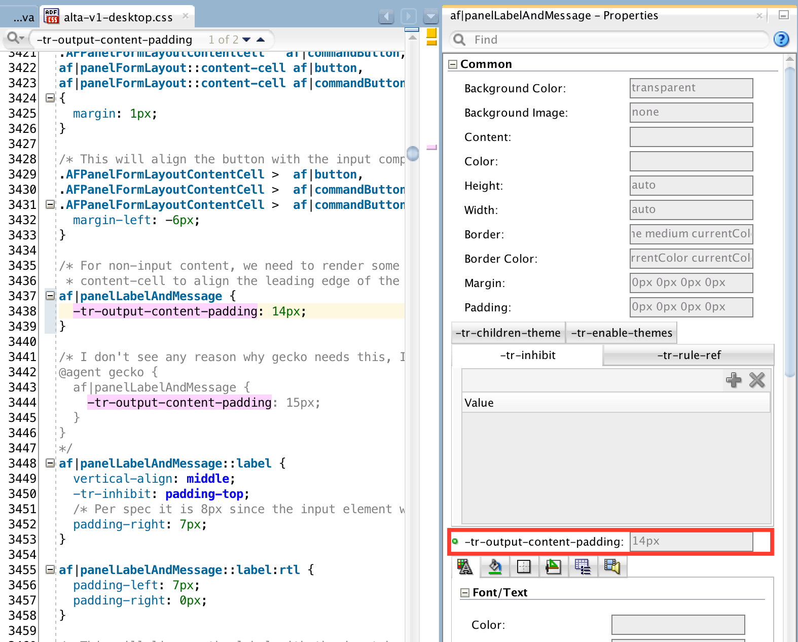
After days of hard working to fix issues of vertical alignment and distribution between different components in a complex form, I realized I need a unified solution, instead of ad-hoc, case by case pixel tuning for Oracle Alta UI skin. This is the second post on Alta UI Workarounds, but it would be first in the table of content of the series.

Considering the massive size of the skin file, the posts and workarounds are by no means exaustive, just some notes, good ideas or bad ideas. We will start from some basic rules and then the panelFormLayout component.

To align inline-level boxes, the basic idea here is to align them vertically using "vertical-align: middle", then make sure the height of all inline-level boxes is as described below.

For replaced inline elements, inline-block elements, and inline-table elements, the height of the inline-level box is their margin box; for non-replaced inline elements, it's their "line-height". Thus, we use a global "line-height"; setup a target line box height, then try best to make the height of margin boxes of all inline elements other than non-replaced inline elements to be the target line box height.

To simplify alignment, as long as possible, try keep vertical padding and margin distributed evenly to the top and bottom side, so that they work for any "vertical-align" value in the same way. For horizontal padding and margin, distribute them evenly to the left and right side, so that they work for both ltr and rtl direction.

Ok, here comes the basic rules I'm using:

.XTargetLineBoxHeight:alias {
  height: 28px;
}

/* The target line-height in pixel for the default font-size (12px) is 18px 
 * (leaving 10px for the top and bottom paddings), thus set line-height here
 * to unitless value of 1.5 (18/12 = 1.5). 
 */
.XDefaultLineHeight:alias {
  line-height: 1.5;
}

/* margin box height = border box height + margin-top + margin-bottom */
.XDefaultFormControlHeightMarginBox:alias {
  -tr-rule-ref: selector(".XTargetLineBoxHeight:alias");
}

.XDefaultFormControlHeightBorderBox:alias {
  -tr-rule-ref: selector(".XTargetLineBoxHeight:alias");
}

.XFormControlVerticalMargins:alias {
  margin-top: 0;
  margin-bottom: 0;
}

/* TODO: revisit this setting */
.XFormCellVerticalPaddings:alias {
  padding-top: 2px;
  padding-bottom: 2px;
}

Now, apply the basic rules to panelFormLayout:

/* in panelFormLayout, use consistent line-height for better vertical
 * alignment and vertical distribution. 
 */
af|panelFormLayout {
  -tr-rule-ref: selector(".XDefaultLineHeight:alias");
}

/* use the same padding for the top and bottom of the form cell to simplify
 * the logic of vertical spacing between cells.
 */
.AFPanelFormLayoutContentCell,
af|panelFormLayout::content-cell,
af|panelFormLayout::label-cell,
af|panelLabelAndMessage::content-cell.AFPanelFormLayoutContentCell {
  -tr-rule-ref: selector(".XFormCellVerticalPaddings:alias");
}

Then, we need style the label in the panelFormLayout component.

/* make label an fixed-height inline-block element, so that it aligns with
 * other components easier, either for start or top labelAlignment, or 
 * for top, middle or bottom vertical-align.
 */
.XLabel:alias {
  box-sizing: border-box;
  display: inline-block;
  vertical-align: middle;
  padding: 5px 0;
  -tr-rule-ref: selector(".XDefaultLineHeight:alias");    
  -tr-rule-ref: selector(".XTargetLineBoxHeight:alias");
}

af|panelFormLayout label {
  -tr-rule-ref: selector(".XLabel:alias");
}

Now, the bad news first, we still have to play that tedious pixel game - fixing line-height and padding for many form control components, especially agent specific styles. The good news is, this time, we have clearly defined simple rules. We can do it in a consistent way. For example, to fix the styles of the inputText component, I have the following:

/* basic styling of inputText */
.XInputText:alias {
  box-sizing: border-box;
  display: inline-block;
  vertical-align: middle;
  margin: 0;
  padding: 4px 6px;
  border-width: 1px;
  -tr-rule-ref: selector(".XDefaultLineHeight:alias");    
  -tr-rule-ref: selector(".XTargetLineBoxHeight:alias");    
}

af|inputText::content {
  -tr-rule-ref: selector(".XInputText:alias");    
}

The really dirty part is actually to remove styles from the inherited skin. I'm trying to do it in this way:

af|inputText::label {
  -tr-inhibit: padding-top;
}
af|inputText::label:rtl {
  -tr-inhibit: padding-top;
}

and in this way:

/* reset native radio and checkbox input elements, so that they line up 
 * with their labels properly. 
 */
.XSelectOneRadioNativeInput:alias {
  position: static;
  vertical-align: middle;
  margin: 0;
  padding: 0;    
}

af|selectBooleanRadio::native-input,
af|selectOneRadio::native-input,
af|selectBooleanCheckbox::native-input,
af|selectManyCheckbox::native-input,
af|selectBooleanRadio::native-input:rtl,
af|selectOneRadio::native-input:rtl,
af|selectBooleanCheckbox::native-input:rtl,
af|selectManyCheckbox::native-input:rtl {
    -tr-rule-ref: selector(".XSelectOneRadioNativeInput:alias");
}

@agent webkit, gecko, ie {
  af|selectOneRadio::native-input,
  af|selectBooleanRadio::native-input,
  af|selectBooleanCheckbox::native-input,
  af|selectManyCheckbox::native-input,
  af|selectOneRadio::native-input:rtl,
  af|selectBooleanRadio::native-input:rtl,
  af|selectBooleanCheckbox::native-input:rtl,
  af|selectManyCheckbox::native-input:rtl {
    -tr-rule-ref: selector(".XSelectOneRadioNativeInput:alias");
  }
}

Here's the display result of the sample page with Alta UI:

Image: panelFormLayout with Alta UI

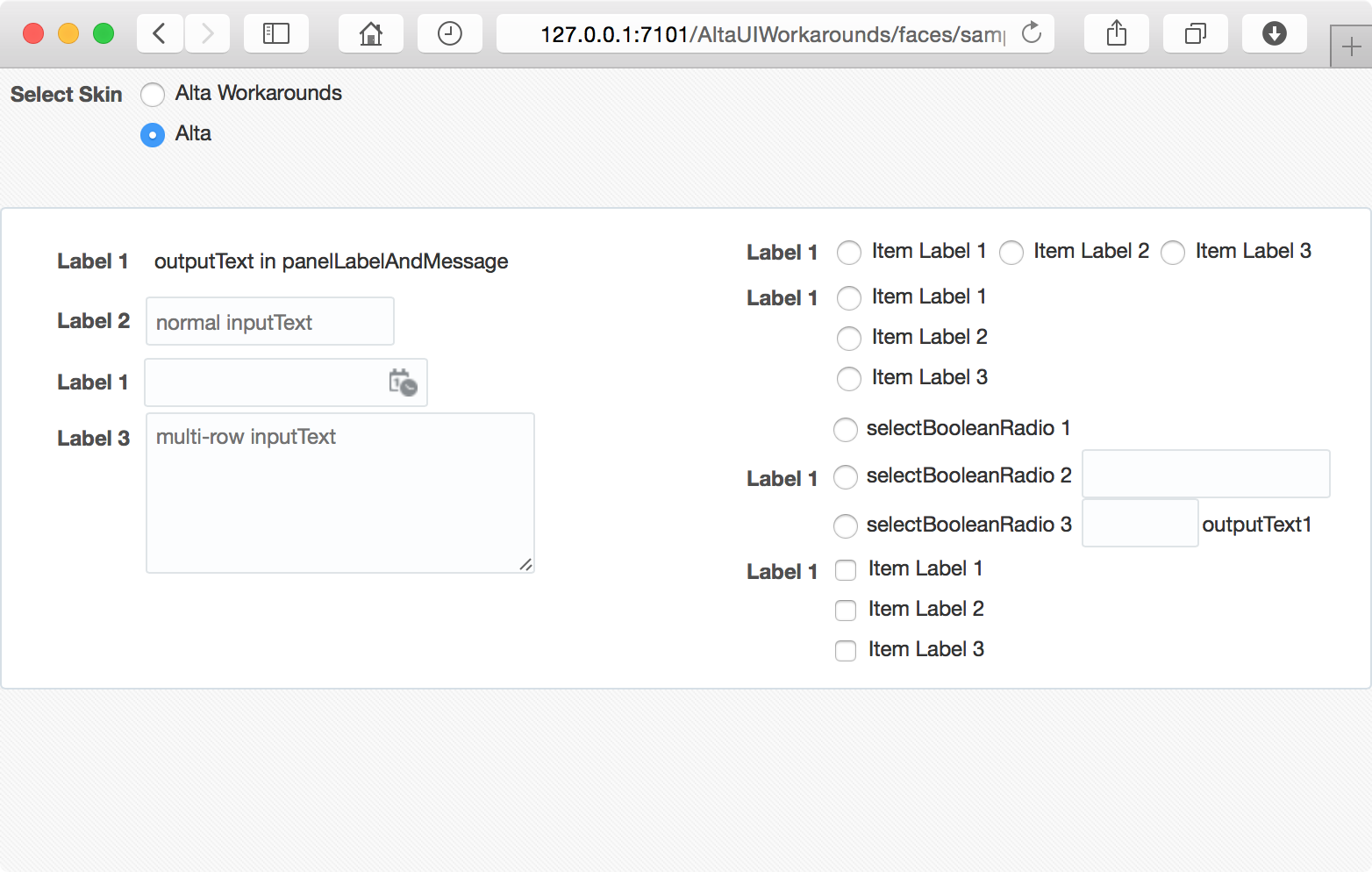
This is the result from the extended UI skin:

Image: panelFormLayout with Alta UI Workarounds

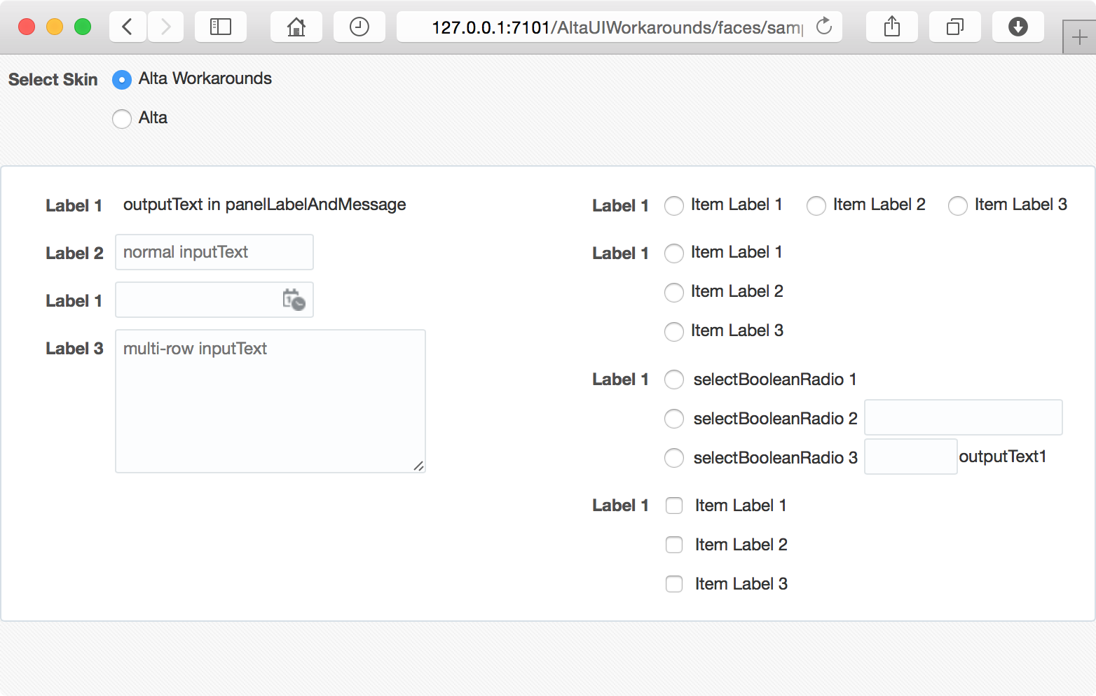
The workaround looks better. It perfectly lines up components and labels horizontally, distributes components vertically, and it works in a consistent way for different components and layouts.

Sample Applications:

Environment:

  • Oracle Alta UI
  • JDeveloper 12.1.3.0.0 Build JDEVADF12.1.3.0.0GENERIC_140521.1008.S
  • Safari Version 8.0
  • Mac OS X Version 10.10

Sunday, December 7, 2014

Alta UI Workarounds - inputDate's vertical-align in webkit

Having a lot of fun, and even more pain in the last month, playing with new Oracle Alta UI. This post is meant to be the opening of the Alta UI Workarounds topic, a collection of short posts on working around Alta UI skin. Check out the AltaUIWorkarounds label and the Sample Application!

Okay, here comes the first case. When the inputDate component is grouped with other sibling components in a panelGroupLayout component, and placed in a panelLabelAndMessage component, and then in a panelFormLayout component, it might not be vertically aligned properly in webkit browsers. Say, the following code:

<af:panelFormLayout id="pfl1">
    <af:panelLabelAndMessage id="plam1" label="Starts">
        <af:panelGroupLayout id="pgl3">
            <af:selectBooleanRadio id="sbr1" text="On" label="On" simple="true"/>
            <af:inputDate id="id1" label="On" simple="true"/>
        </af:panelGroupLayout>
    </af:panelLabelAndMessage>
</af:panelFormLayout>

The fragment is rendered like this:

Image: inputDate with Alta UI

Th problem is in the Alta UI skin file (alta-v1-desktop.css, ln:6133):

@agent webkit {
  af|panelLabelAndMessage::content-cell.AFPanelFormLayoutContentCell af|inputDate {
    /*TODO ALTA*/
    vertical-align: 50%;
  }
}

To fix the issue, simply override the rule in your extended skin file like this:

@agent webkit {
  af|panelLabelAndMessage::content-cell.AFPanelFormLayoutContentCell af|inputDate {
    vertical-align: middle; /* vertical-align: 50%; (ln:6133) */
  }
}

Now the fragment is rendered as expected:

Image: inputDate with Alta UI Workarounds

Vertically aligning those input components in a consistent way, say with vertical-align: middle, helps to avoid this kind of glitches.

Sample Applications:

Environment:

  • Oracle Alta UI
  • JDeveloper 12.1.3.0.0 Build JDEVADF_12.1.3.0.0_GENERIC_140521.1008.S
  • Safari Version 8.0
  • Mac OS X Version 10.10

Friday, December 5, 2014

ADF - Change Skin at Runtime

For a ADF Faces application, you can configure the skin family for the application in the trinidad-config.xml file. The trinidad-config.xml allows you to define properties using the Expression Language (EL) or static values. The skin-family is one of such properties that accepts EL expression as the value, so that you can enable end users to change the application’s ADF skin at runtime by exposing a component that allows them to update the value of the skin-family property.

In the Sample Application, the `trinidad-config.xml” file is configured like this:

<?xml version="1.0" encoding="UTF-8"?>
<trinidad-config xmlns="http://myfaces.apache.org/trinidad/config">
  <skin-family>#{skinSelectorBean.skinFamily}</skin-family>
</trinidad-config>

Then in the sample page, a selectOneRadio component is provided, allowing end users to switch between the Alta skin and the Skyros skin:

<af:selectOneRadio id="sor1" label="Select Skin" autoSubmit="true"
                   valueChangeListener="#{skinSelectorBean.skinFamilyValueChanged}"
                   value="#{skinSelectorBean.skinFamily}">
  <af:selectItem id="si1" label="Alta" value="alta"/>
  <af:selectItem id="si2" label="Skyros" value="skyros"/>
</af:selectOneRadio>

When the end user chooses the skin from the list, the skinFamily property value of the backing bean is updated, and then the valueChangeListener method of the backing bean is called. The method updates the whole view in response to the change of the skin, such that the view is rendered with the selected skin. Here, nothing special. The only interesting part is how to update the whole view properly. Please see the comments for the detail.

public void skinFamilyValueChanged(ValueChangeEvent valueChangeEvent) 
throws IOException {
    // ValueChangeEvent is handled in the PROCESS_VALIDATIONS phase. 
    // Calling refreshPage() will skip the UPDATE_MODEL_VALUES phase 
    // which we need to update skinFamily. We have to queue this event 
    // to the INVOKE_APPLICATION phase.
    if (valueChangeEvent.getPhaseId() != PhaseId.INVOKE_APPLICATION) {
        valueChangeEvent.setPhaseId(PhaseId.INVOKE_APPLICATION);
        valueChangeEvent.queue();
        return;
    }

    // refresh the whole view
    refreshView();
}

private void refreshView() {
    FacesContext facesContext = FacesContext.getCurrentInstance();
    String viewId = facesContext.getViewRoot().getViewId();
    ViewHandler viewHandler = facesContext.getApplication().getViewHandler();
    UIViewRoot root = viewHandler.createView(facesContext, viewId);
    root.setViewId(viewId);
    facesContext.setViewRoot(root);
}

Chinese Summary:

trinidad-config.xml 配置文件中,可以设置 skin-family 属性的值为 EL 表达式。通过相应的组件可以允许用户在运行时更新该表达式的值,从而动态地选择用应用程序的 ADF 皮肤。

Sample Application:

Environment:

JDeveloper 12.1.3.0.0 Build JDEVADF_12.1.3.0.0_GENERIC_140521.1008.S